Showing posts with label User interface. Show all posts

Sunday, 6 October 2013

Enable the Updated New Tab Page in Chrome for Android

If you like Chrome's updated new tab page for the desktop and you have an Android device, you can enable a similar new tab page in Chrome Beta for Android.


You first need to install Chrome Beta for Android if you don't have it already, then open a new tab and type this in the address bar:

chrome://flags/#enable-new-ntp

Then press Enter, pick "Enabled" from the drop-down below "Enable the new NTP" and tap "Relaunch Now" at the bottom of the window to restart the browser.


The updated new tab page no longer shows 3 sections. You only get a big Google logo, a search box that points you to the browser's omnibox, a list of the most visited pages and 2 buttons for bookmarks and tabs from other devices. Both buttons open new pages: the bookmarks page has a different interface (it's now a list instead of a grid), while the "other devices" page looks the same.


Chrome's blog informs that some Chrome Beta users might see the new interface automatically. "We've tested this New Tab page with a search bar on desktop and now want to bring the benefits, including a faster load time, to mobile as well. While you can search straight from the Omnibox in Chrome, we realized many users continue to visit their search engine's homepage before searching, so we wanted to make it faster for those users to search. We're always thinking about how to save milliseconds from every search you perform, and we hope this new feature will save you time on-the-go."

If the new interface has been enabled automatically, you can use the same instructions to disable it. Just pick "disabled" instead of "enabled".

The updated new tab page has some advantages: it loads quickly, it's consistent and it looks nice. Unfortunately, bookmarks and the list of tabs from other devices load in separate pages and you can no longer see them automatically when you open a new tab. I created a folder with mobile apps I frequently use and this folder used to be displayed when opening a new tab. This feature is no longer available in the new interface. Unlike the desktop Chrome, the mobile Chrome doesn't support extensions and you can't customize the new tab page.

This "baby" new tab page could be useful to help users discover the omnibox and use it to search the web, but what happens when they realize that the big search box is redundant? And what about the people who already used the omnibox?

New Google Image Search for Mobile

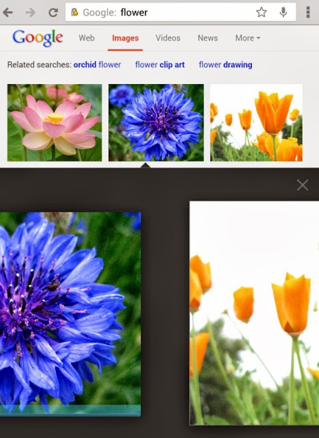
Google's image search engine has a new interface for smartphones and tablets. The new UI looks just like the desktop UI, but you can use swipes to navigate between the image results.

Here are some screenshots from my Nexus 7. When you tap an image result, a black box with a bigger version of the image will open. You can also find some additional information about the image.


Swipe left to see the next image result, swipe right to go to the previous result. Gestures work just like the left/right keyboard shortcuts in the desktop interface. Tap an image to open the page that includes it.


A similar interface is available for smartphones. Here's a screenshot from an iPhone running iOS7:


Google will probably say that it changed the interface to make it more consistent and provide an unified interface for both desktop and mobile devices. There are some other advantages: you can scroll down to see more results, you can scroll up and quickly change the query or switch to web search.

I find the old interface more intuitive and better suited for mobile devices. It made it more obvious that you can use gestures by showing the previous and the next image result, search results didn't move around and you could find more information about the images. The new smartphone interface only displays the domain name and it no longer shows the title of the page and the image size (the tablet interface still shows them). Here's a screenshot of the old UI:

Thursday, 3 October 2013

YouTube Updates Center-Aligned UI, Adds Carousel

YouTube's experimental interface now uses carousels on the homepage, so it can show more videos from a channel. Video thumbnails are also much bigger. The regular interface also uses carousels, but only when you are signed in.

It's another version of the center-aligned layout, which uses a persistent header, a guide sidebar that's visible only when you click "Guide" and a card-style interface.


Here's how you can enable the experimental feature. If you use Chrome, Firefox, Opera, Safari or Internet Explorer 8+:

1. open youtube.com in a new tab

2. load your browser's developer console:

* Chrome or Opera 15+ - press Ctrl+Shift+J for Windows/Linux/ChromeOS or Command-Option-J for Mac

* Firefox - press Ctrl+Shift+K for Windows/Linux or Command-Option-K for Mac

* Internet Explorer 8+ - press F12 and select the "Console" tab

* Safari 6 - if you haven't enabled the Develop menu, open Preferences from the Safari menu, go to the Advanced tab and check "Show Develop menu in menu bar". Close Preferences and then press Command-Option-C to show the console.

* Opera 12 - press Ctrl+Shift+I for Windows/Linux or Command-Option-I for Mac, then click "Console".

3. paste the following code which changes a YouTube cookie:

document.cookie="VISITOR_INFO1_LIVE=lnq3tYnrDNU; path=/; domain=.youtube.com";window.location.reload();

4. press Enter and close the console.

To go back to the regular interface, use the same instructions, but replace the code from step 3 with this one:

document.cookie="VISITOR_INFO1_LIVE=; path=/; domain=.youtube.com";window.location.reload();

{ Thanks, Rubén and Ramona Brown. }

Monday, 30 September 2013

Google Mobile Image Search Regression

Google has a great mobile interface for image search. It was launched in 2010 and improved multiple times since then. You can use swipes to go to the next image result or to the previous one. It looks like Google changed the image search UI for smartphones and tablets and now sends you to a landing page that shows the image and loads the corresponding page in the background. Intuitive gestures are gone and now you have to use the back button.


This seems to be limited to iPhones and iPads running iOS 7, so it's probably a bug. A lot of people complain about this in the Google Search Forum.

There are many reasons why the new interface is strange: loading the associated page uses more bandwidth and that's not a good idea for mobile devices, it's more difficult to check multiple search results, thumbnails are smaller and even the desktop interface shows a bigger image instead of sending users to a new page.

Friday, 27 September 2013

Card-Style Interface for Google Mobile Search

As previously anticipated, Google's mobile site has a new layout that uses cards, just like Google Now, Google Maps, Google+ and an increasingly long list of Google services and apps.

"A new look and feel for Google Search and ads on your phones and tablets. It's cleaner and simpler, optimized for touch, with results clustered on cards so you can focus on the answers you're looking for," informs Google's search blog.


Ads stand out a lot more and, depending on your phone's resolution and screen size, you might not even see a regular search result without scrolling down. Google shows up to 2 ads at the top of the page and no longer uses a different background color. There's just a small "Ad" label next to the URL.


Sections are clearly separated and there's more white space, so the information density is lower.


Pagination has been simplified and you can only go to the previous or the next page of results and to the first results page.

Thursday, 19 September 2013

Google Tests New Interface for Music Video Results

Google tests a new interface for top search results, but only for music videos. The experimental interface adds a huge 480x360 thumbnail and shows the name of the artist, the album and the year when it was released.


Here's the regular version:


I think the thumbnail is way too big and the top result shouldn't dominate the entire page, especially when it comes to videos.

{ Thanks, Yvo. }

Try Google's New Logo and Navigation Menu

So many iOS developers had to change app icons and make them flat for iOS7. Flat is now fashionable, so you should expect to see some changes even if you don't use Apple's devices.

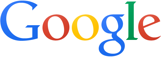
I've mentioned in a previous post that Google tests a new logo that's flat, minimalist and reduced to its essence, but someone from Google denied that this will replace the traditional logo. This is obviously not true: it's a Google experiment, the logo is hosted on Google's servers, the URL is very similar to the URL of the current Google logo and even Chrome starts to include it.


Here's how you can enable the new logo and the new navigation interface. If you use Chrome, Firefox, Opera or Internet Explorer 8+:

1. open google.com in a new tab

2. load your browser's developer console:

* Chrome or Opera 15+ - press Ctrl+Shift+J for Windows/Linux/ChromeOS or Command-Option-J for Mac

* Firefox - press Ctrl+Shift+K for Windows/Linux or Command-Option-K for Mac

* Opera 12 - press Ctrl+Shift+I for Windows/Linux or Command-Option-I for Mac, then click "Console"

* Internet Explorer - press F12 and select the "Console" tab.

3. paste the following code which changes a Google cookie:

document.cookie="PREF=ID=e66a207a51ceefd8:U=936bafc98b2a9121:FF=0:LD=en:NR=10:CR=2:TM=1378808351:LM=1379592992:SG=1:S=OXyq0fqClYB66VuV ; path=/; domain=google.com";window.location.reload();

4. press Enter and close the console.

To go back to the regular interface, use the same instructions, but replace the code from step 3 with this one:

document.cookie="PREF= ; path=/; domain=google.com";window.location.reload();

{ Thanks, André Zlatin. }

Google Rolls Out New Navigation Interface

After so many posts about Google's new navigation menu, it looks like this feature will roll out to everyone in the coming weeks. It's time to say goodbye to the black navigation bar, which didn't look that great, but it was always at the top of almost any Google service, so you could quickly navigate to other Google sites.

"We'll be rolling out this new feature in the next few weeks...stay tuned," says Justine Rivero, from Google. "The new design has been under testing for over half a year, with reports coming in as early as February 2013 regarding the new grid menu," informs Google+ Daily.


The new grid icon shows a list of 9 popular Google services (Google+, Web Search, YouTube, Maps, Play, News, Gmail, Drive, Calendar) and you can click "more" or scroll down to see 8 other services (Translate, Books, Offers, Wallet, Shopping, Blogger, Finance and Google+ Photos). The services that are missing: Google Image Search, Google Mobile and Google Video Search (they are available in the black navigation bar). The homepage only includes links to Gmail and Image Search next to the grid icon.


Here's the old navbar:


The new navigation menu looks just like the Chrome app launcher or the apps section of the Google Search app for iOS. It includes icons for each Google service, so that they look more like real apps.

For the first time, YouTube will have a Google navigation menu and the interface will be more consistent.

It will be interesting to see if the app launcher will be more successful than a similar interface launched in 2011 and removed after a few months. You had to click a small arrow next to the Google logo to see a huge menu that included a lot of Google services. The menu was hidden by default, so it wasn't easy to find (Google's homepage expanded it, but that didn't save the short-lived menu).


Update: here's how you can enable the new interface.

Update 2: Google's search blog announces the changes. "We're introducing an updated Google bar that streamlines your experience across products and devices. Your Google products are now accessible under a new app launcher, located at the top right of the screen. Just click on the familiar 'Apps' grid, also present on Android devices and Chromebooks. As part of this design, we've also refined the color palette and letter shapes of the Google logo. We'll be rolling out this update across most Google products over the next few weeks, so keep an eye out and let us know your thoughts."

{ via Google+ Daily }

Tuesday, 17 September 2013

YouTube Tests Improved Center-Aligned Interface

Now that many of the YouTube experiments are publicly available, it's time for something new. YouTube tests a new version of the center-aligned layout. The sidebar looks better, but it's still hidden by default. The YouTube homepage has two tabs for "What to watch" and "My subscriptions", while the header is now persistent.


Here's a video that shows a slightly different version of the experiment:


Here's how you can enable the experimental feature. If you use Chrome, Firefox, Opera, Safari or Internet Explorer 8+:

1. open youtube.com in a new tab

2. load your browser's developer console:

* Chrome or Opera 15+ - press Ctrl+Shift+J for Windows/Linux/ChromeOS or Command-Option-J for Mac

* Firefox - press Ctrl+Shift+K for Windows/Linux or Command-Option-K for Mac

* Opera 12 - press Ctrl+Shift+I for Windows/Linux or Command-Option-I for Mac, then click "Console"

* Safari - check this article

* Internet Explorer - press F12 and select the "Console" tab.

3. paste the following code which changes a YouTube cookie:

document.cookie="VISITOR_INFO1_LIVE=Gapj9bz_H8M; path=/; domain=.youtube.com";window.location.reload();

4. press Enter and close the console.

To go back to the regular interface, use the same instructions, but replace the code from step 3 with this one:

document.cookie="VISITOR_INFO1_LIVE=; path=/; domain=.youtube.com";window.location.reload();

{ Thanks, Sushubh and Rubén. }

YouTube Music Cards

A few weeks ago, I posted about a YouTube experiment that adds bigger cards for music artists. Search for Röyksopp, Daft Punk or any other popular artist and you'll see a Knowledge Graph-like sidebar with a list of top tracks, albums and related artists. Click any track and you'll start a playlist with a lot of other songs from the same artist. Click an album and you'll be able to listen to all the songs from the album.


What else is there? You can also click "top tracks" to start the playlist automatically generated by YouTube. Click the artist's name to visit the topic channel created by YouTube (there's no topic channel for Röyksopp, but there's one for Daft Punk).


Gmail's Old Compose Interface, Still Available

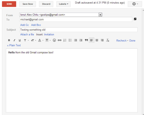
A lot of people complained about Gmail's new compose interface. Google addressed some of the issues with the "full-screen" mode, but there are still people who dislike the new UI.

If you want to go back to the old interface, there's a Chrome extension that does this: Retro Compose for Gmail. I rarely recommend third-party apps that change Gmail, especially if they're not from a reliable company or developer. I checked the extension's source code and I was surprised to see how it works: it changes your browser's user-agent to IE8's user-agent, but only when loading Gmail. As Google says, "you won't be able to try the new compose experience if you're using Internet Explorer 8". I'm not sure why the extension is not restricted to mail.google.com.


I tried to manually change the user-agent in Chrome and Firefox, but Gmail redirected me to this page:
"Gmail requires ActiveX controls to be enabled". Pressing F12 in IE10 and switching to "Browser mode: IE8" worked.

Obviously, this is a temporary workaround. At some point, Google will stop supporting Internet Explorer 8 and this will no longer work. It's a better idea to get used to the new interface.

Update: Here's a similar Chrome extension that doesn't have a button and has better permissions.

{ Thanks, 翔美咲. }

Sunday, 15 September 2013

New Google Trends Interface

Google Trends has a new interface that changes how you add search terms and how you compare search volumes. There's still a search box at the top of the page, but its role has been deemphasized. The old interface placed search terms in the left sidebar, while the new UI shows some big building blocks above the chart. Filters have also been moved to the top of the page.


The "Top Charts" page now includes trending charts, not just lists of the most searched topics. There charts for actors, animals, authors, books, cars, chemical elements, cities, colleges and universities, countries, drinks, games, medications, movies, people, scientists, software technologies, space objects, sports teams, TV shows, and more.


The "Hot Searches" section has a calendar view that shows the hottest topics from the past 30 days. It looks nice. "Click the new calendar icon at the top of the Hot Searches page for any of our thirteen supported countries. Hover on a topic for some quick information and a link to see more search trends from the day," informs Google.


{ via Inside Search }

Thursday, 12 September 2013

YouTube's Compact Controls

A few weeks ago, YouTube tested a feature that grouped controls like annotations, video quality and player size. This feature is now publicly available.

"Notice something a little different about YouTube videos? We've just launched a new version of the player with improved caption controls and a cleaner look. If you're looking for the annotations switch, just click the gear button - you'll find size and quality controls there too," informs YouTube.


The gear button was previously used for the quality dropdown. This change makes the player less cluttered and makes the video quality dropdown less visible. When YouTube removes it, fewer people will complain.

Now it's hard to tell if a video has annotations without clicking the settings button. Each of the settings require an extra click.

{ Thanks, Tolis and Sushubh. }

Tuesday, 10 September 2013

Google Tests a New Logo

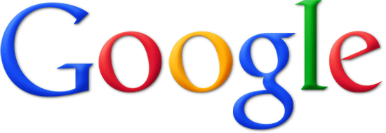
Not only Marissa Mayer and her team at Yahoo worked on a new logo. Google also tests a new logo that's flat, minimalist, fresher and reduced to its essence, as Sir Jonathan Ive would say.


Here's the existing logo from the Google homepage:


This reminds me of Chrome, which switched from the original 3D logo to a flat logo back in 2011. "We're working on refreshing the icon to better represent the speed and simplicity of the modern browser and operating system," said Google at that time.

Update: The Verge reports that "a person familiar with Google's branding [says that] this is not a replacement for the company's traditional logo. Instead, the flatter design is used in instances where the beveled logo may not display well — such as on printed banners or other corporate use cases."

{ Thanks, Rubén and Artem. }

Google Tests Card-Style News OneBox

Google tests a card-style interface for the Google News OneBox. It's bigger, snippets are shorter, there's a lot of white space and the link to Google News search results is placed at the bottom of the card.

Here's a screenshot of a Google France search results page:


{ Thanks, Frédéric. }

Thursday, 5 September 2013

Google's Welcome Message for the New Navigation Interface

Google now shows a welcome message next to the app launcher icon: "Welcome to the new way to find your favorite Google products. Click the grid to have a look."


The app launcher will replace the black navigation bar. For now it's still an experiment and you can enable it in Chrome. Google will have a special interface for Chrome and the Google homepage will replace the new tab page.


In other news, Google's CSS sprite now has a high-resolution version that's great for devices like Retina Macbook Pro or Chromebook Pixel. All the icons, buttons, arrows and logos will look better.

Saturday, 31 August 2013

Panoramio Redesign

Google's Panoramio service has been redesigned and now looks just like a Google Maps extension. The new interface (codenamed "acrylic") is borrowed from Google Maps Views. You can go back to the old UI by clicking "Return to classic Panoramio".

"We've made photos the hero on the page while still keeping the important features that people enjoy. On the photo page, by far the most popular on the site, we've made the photo over three times bigger! We've also made thumbnails on the profile page and the world map significantly bigger. We know that Panoramio members have used the existing design for years, so the 'classic' version will still be available for a little while," mentions the Panoramio blog.


Panoramio has a lot of great photos from all over the world and it's an important source of high-quality photos for Google Maps and Google Earth. That's the reason why Google acquired the service back in 2007.

Adam Lasnik, a former Google Search Evangelist, is now Program Manager at Panoramio and his team launched Google Maps Views. "Many of the same people (including me!) work on both products, but Views and Panoramio currently serve different purposes: Views is a community for sharing photo spheres, while Panoramio is a community for sharing traditional photos," says Adam.

{ Thanks, Georg. }

Friday, 30 August 2013

Google Tests a New Tablet Search Interface

Remember the card-style redesign for Google mobile search? Google tests a similar interface for tablets:


There's more white space, top search results stand out even more, while Knowledge Graph cards and results from specialized Google search engines look like distinct sections of the page.

{ via Techno-Net }

New Google Sign-in Page for Mobile Devices

Google's mobile sign-in page has a new interface that uses the same slogan from the desktop: "One password. All of Google." It's a more crowded page that includes a silhouette icon, a list of icons for Google services like Gmail, YouTube, Google Maps and a small "Create an account" link at the bottom of the page instead of the red "sign up" button.


Here's the old interface:


For some reason, the new sign-in page lacks the "stay signed in" checkbox.